The Project
Add a dashboard to Sysco’s customer portal, allowing customers to track their delivery trucks for the day.
Add a help section to the portal, consisting of a training section (videos and PDFs) and an FAQ section.
My Tasks
Create and present wireframes to the customer. Collaborate with designers to make sure the UI meets the customer’s needs. Create a design deck for the developers, explaining how all components are intended to work, so all functionality is implemented as designed.
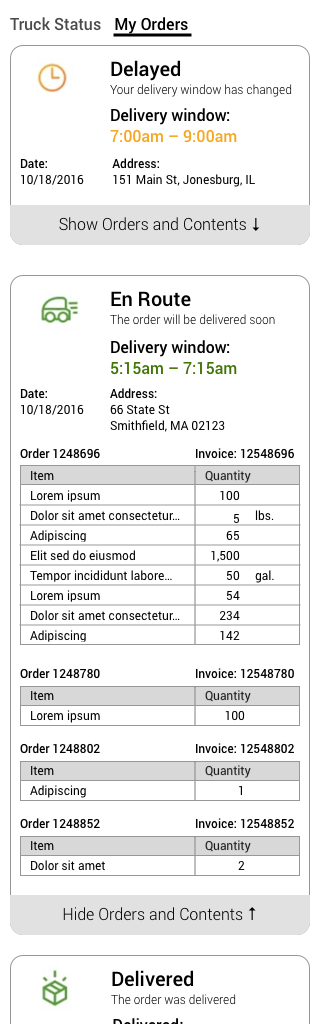
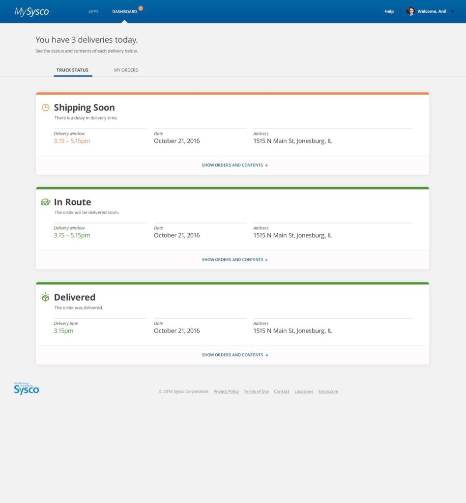
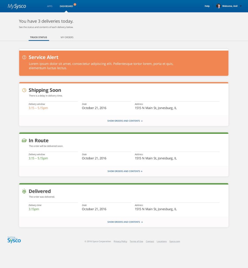
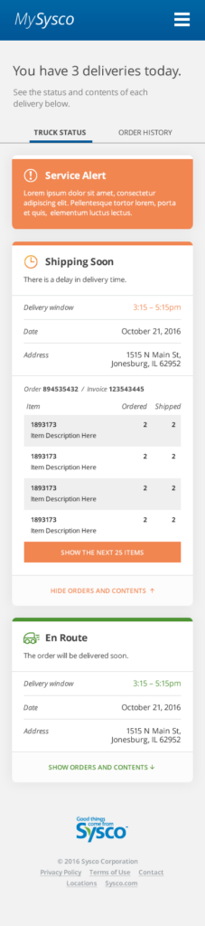
Dashboard: Truck Status
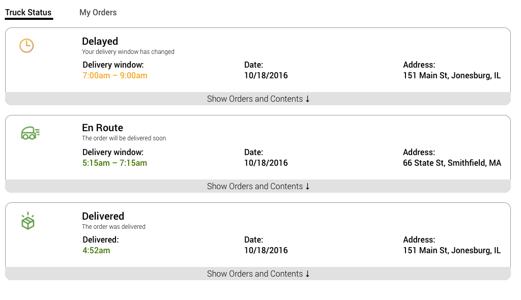
- Links at the top allow you to switch from Truck Status to My Orders, and indicates which is the current page (“Truck Status”)
- There are three icons, showing order status:
- Delayed
- Delivered
- En Route
- Any order being delivered today which has not yet been delivered is considered “En Route”
- There are two colors:
- An orange or red for delays/alerts
- A green for on time and delivered orders
- In the “closed” state, the delivery cards show the delivery window (or exact delivery time, after the order has been delivered), the delivery date, and the delivery address.
- Address is shortened to one line: street, city and state. If the address is too long, it will be concatenated with “…” so it fits.
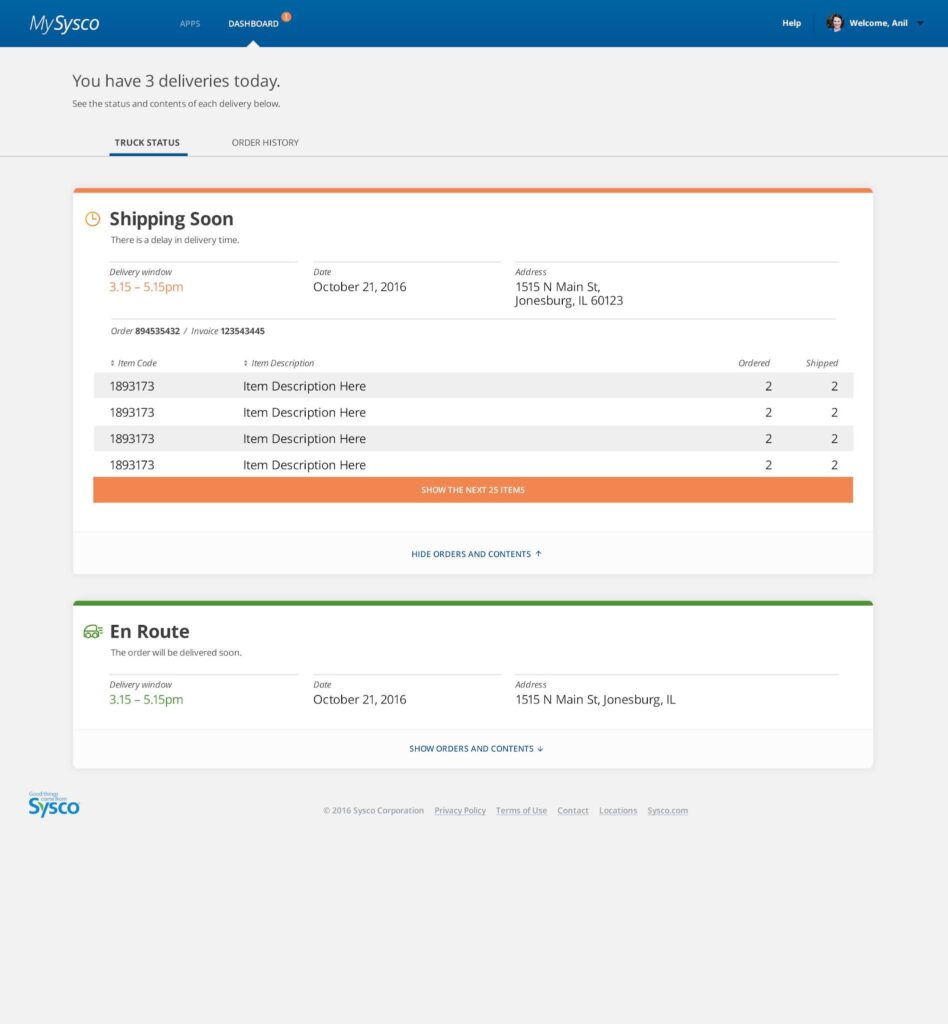
- There’s a link at the bottom, “Show Orders and Contents”, with a down arrow or similar icon; clicking it will expand the delivery card and show all relevant information
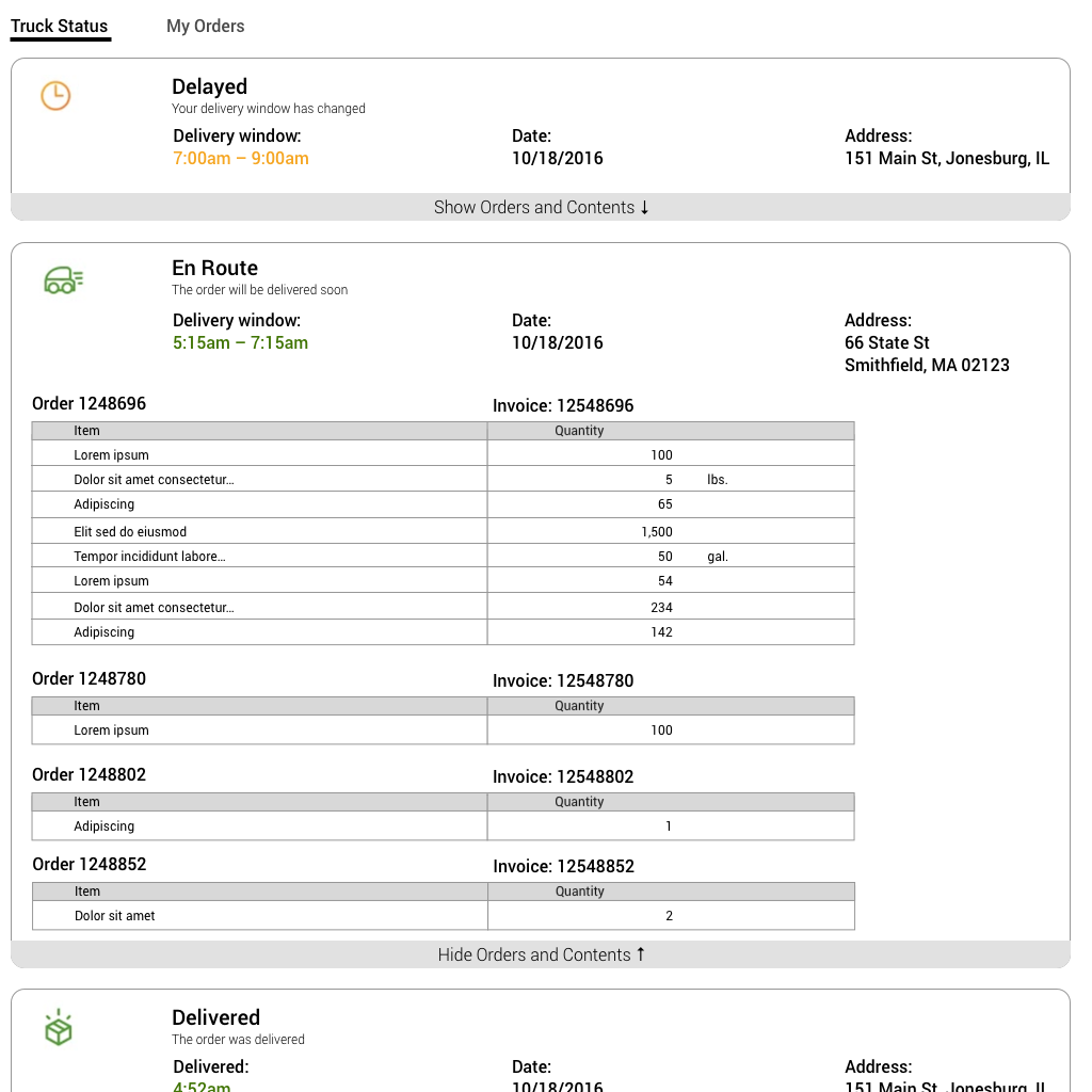
- When the card is expanded, the link at the bottom changes to “Hide Orders and Contents” and the icon changes to an up arrow or similar
- When the card is expanded, the address is shown in full
- The other information shows when the card is collapsed does not change
- The orders included in the delivery are shown separately under the rest of the delivery information.
- Each order includes:
- Order number
- Invoice number
- A table containing
- Item name
- Item quantity
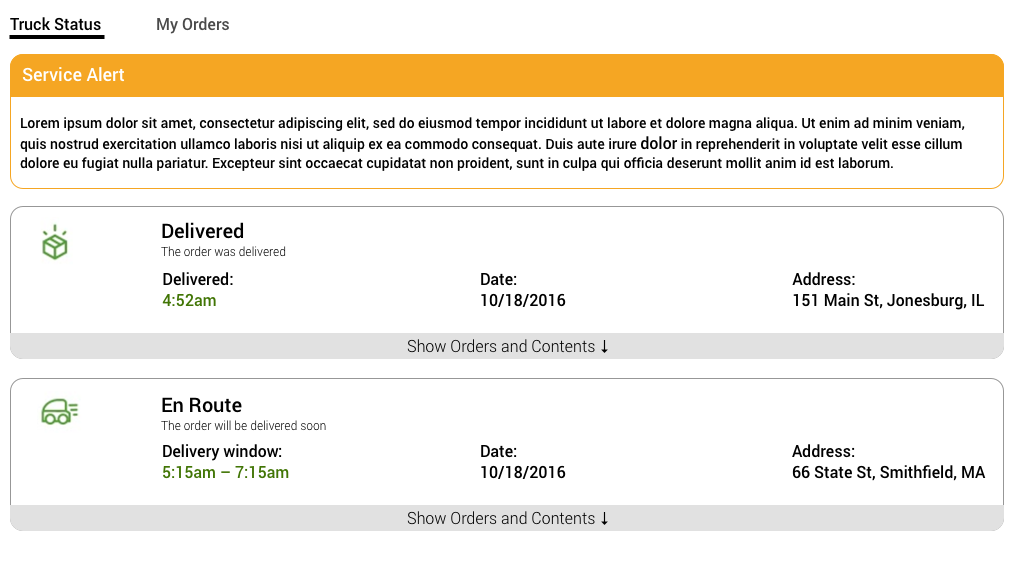
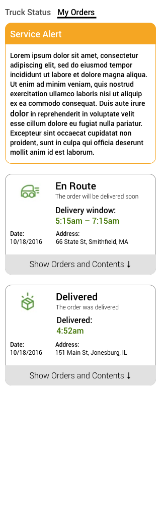
- In the event of a service-wide alert, that alert will be shown in its own card at the top of the page.
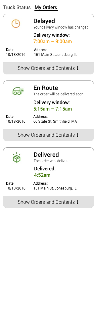
- Mobile versions will work just like the desktop versions, with some rearranging of information.
Final designs:
Help: Training
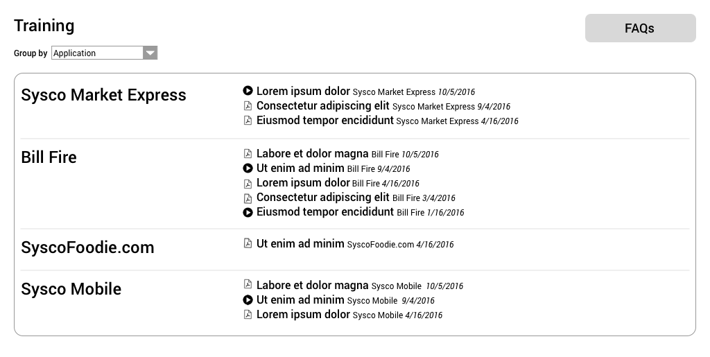
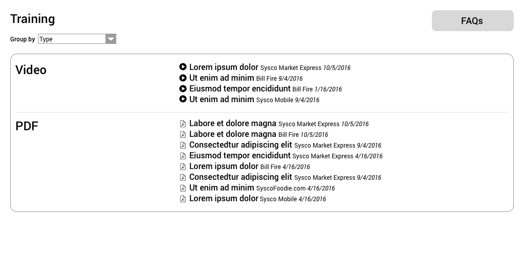
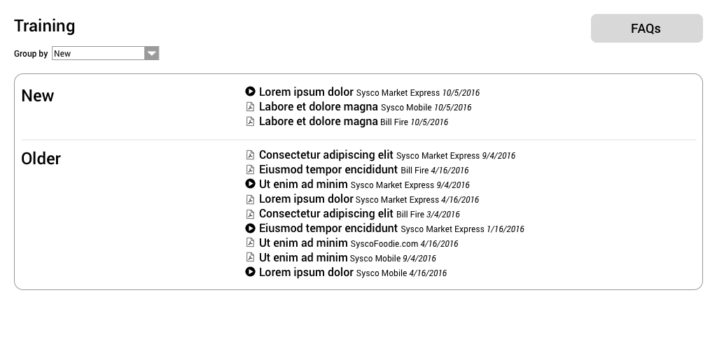
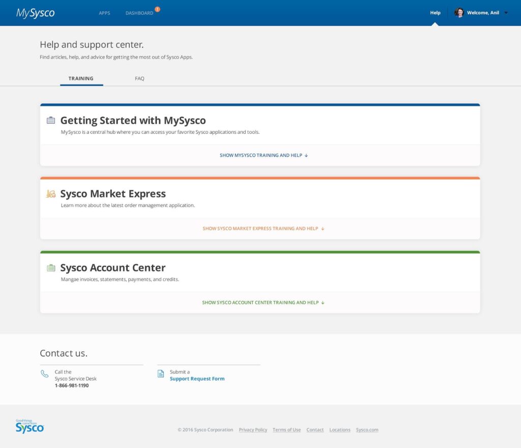
- On entering the training page, the user sees all training areas, stacked on top of each other, starting with the general “Getting Started” section and continuing with sections for each app.
- Each section is colored to match the colors used for that app on the home page. The icon will also match the icon used on the home page.
- Each section has a “show” link with an down arrow at the bottom. Clicking the link will open up the section and show all the training items under it.
- There is a “Contact Us” section at the bottom of the page.
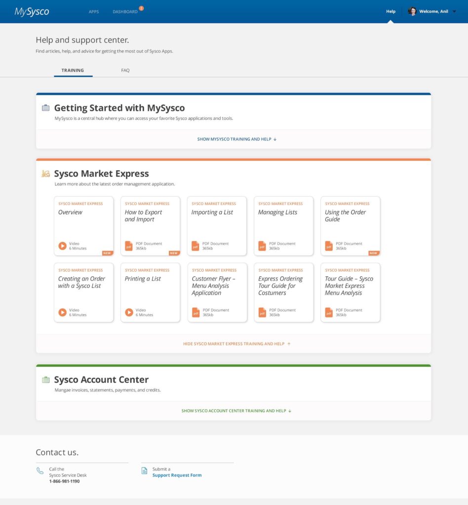
- Within each open section, there are tiles for each training item. Each tile has:
- A name
- An icon (video or PDF)
- A type (video or PDF)
- A length (for videos) or file size (for PDFs)
- For new videos, a “new” marker
- We have not defined how recent a training item needs to be for it to be “new”, but we can start with created date < 1 year ago.
- The colors within the tiles match its section; they are shown in orange, but should be green in the green section and blue in the blue section.
- At the bottom of the section is a “hide” link with an up arrow, to collapse the section.
- There is a “Contact Us” section at the bottom of the page.
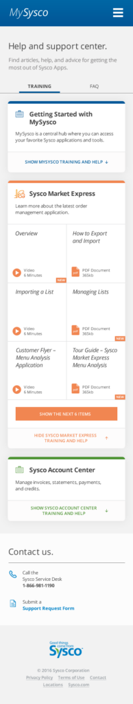
- In mobile, the training item tiles will change in style to fit more closely together—no margins between them, and no rounded corners.
- When first opening up a section, the first 6 items only will show, with a “show next XX items”, where XX is the number of remaining items, 6 max.
- If there are 6 or fewer remaining items, clicking the bar shows all the order items, and hides the “show” bar.
- If there are more than 6, clicking the bar shows 6 mote and updates XX in the bar to the remaining items, or 6 max.
- The Contact Us information will also be rearranged from two columns to one.
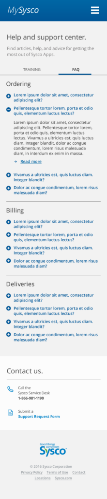
Help: FAQ
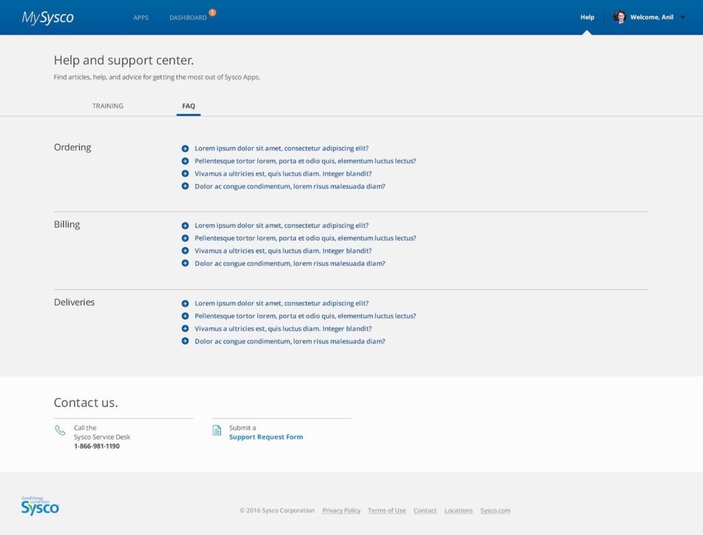
- FAQs are grouped into categories.
- Each closed question has a (+) icon next to. Clicking the question or the icon will open it up.
- There is a “Contact Us” section at the bottom of the page.

- When sections open up, the (+) icon becomes a (-). Clicking the question or icon again will close it.
- The question has an optional link at the end.
- More than one question can be open at once.
- There is a “Contact Us” section at the bottom of the page.
- In mobile, the questions are listed underneath the section headers.
- The Contact Us information will also be rearranged from two columns to one.